Thursday, 26 April 2012

Finally! Some animation!

26th April 2012

It's interesting how a simple change in the color of the layout in TV can change your attitude towards animation. It started making my frames look better! Here is the old one VS the changed one.


I know, right? Anyway, the animation's finally kicked off! Atleast I've done something I'm proud of today.
We went together to speak to Shyamu (our HOD) about getting our deadlines extended. Somehow came to settlement to finish atleast one shot complete with the inking, color, bg and sound. Phew. Will also get a briefing on our colloquium paper on Monday. That's kinda a thesis paper.

Besides that on the Animation side, we're all going for 'The Avengers' tomorrow! Can't wait. We were so eager we pre-booked the tickets online and got top row seats! It better be good. The last one I saw was Thor, and I was horribly dissappointed with that.

That's all for tonight.

Wednesday, 25 April 2012

Gesture Drawing Session - April 25

25th April 2012

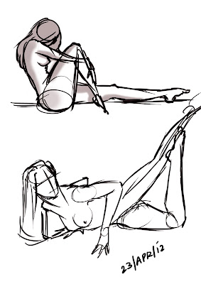
More gestures that I did this morning. I can't figure out if I'm getting better or worse! You tell me! :(


Tuesday, 24 April 2012

Gesture Drawing Session - 24th April

24th April

Wow, I can't remember the last time I sketched/posted gestures! True, it's been a long time - but also true is my state of absolute stress and escaist tendencies. I've been running away from the fear of making a shitty movie and involving myself in games like Alladin (a childhood comfort) and Pottermore (this is based ON my childhood (Harry Potter)). I wish it never got over and JK Rowling lived as long as Nicholas Flamel. The fever is not back - it never died. I hate it when I talk about Hogwarts and people tell me to grow up! Anyway, more on that later (hopefully).

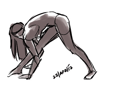
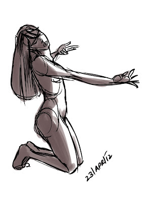
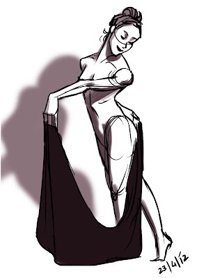
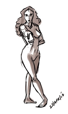
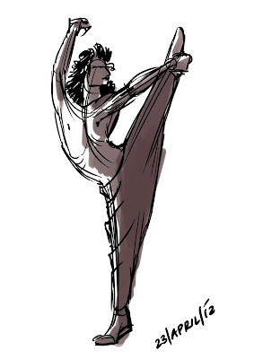
Gestures have become highly dependent on self-initiative now. Since juries are closing in, everyone's buy with coursework and noone has the time to sketch gestures. I was feeling super let down and rusty, so I sketched these from the AMAZINGly resourceful gesture drawing tool from Pixellovely. I used to use this for anatomy study as well.

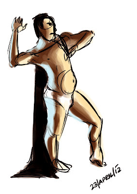
So here's how they turned out. I'm embarassed! I went from getting-better to smelly drawings! Anyway. They all took about 1 minute to sketch and 1 minute for tone. Here goes.


I've sketched this Asian man before. He always seemed to have weird anatomy to me. Here I tried to quickly study color along with the lighting. Pretty decent for the first time eh?


Saturday, 14 April 2012

Warrior Review

13th April 2012

When En told me I'd feel happy after watching Warrior, I gave him 'the look'. How can I film named 'Warrior' make me happy? He said I would like it. Of-course I liked it, not only that, I loved it. It was absolutely stunning. Technically the shots weren't artsy and I don't think that was the purpose of the director anyway - but it sure had a lot of continuity. The film goes through a lot of emotional conflicts more than anything else. After a point you're in their shoes. From the beginning you know what the end is gonna be - the two brothers will have to fight against each other - it is predictable. What you don't know how they will arrive at that point, and you want to know who will win and what will happen to them after that.


Warrior was very close to 'Fighter' in terms of the concept, but it was so much more emotionally satisfying, it breaks my heart. Nick Nolte who plays the father has acted so well that after a long time I cried for a character. Tom Hardy makes you hate him and Joel Edgerton makes you want him to win at every point. It's gripping throughout and it makes your heart ache. It makes you cheer with them, laugh with them, get angry with them and feel pain with them. Absolutely wonderful.

Francis character design!

13th April 2012

Here's the character development and design of my lead character - Francis Dias - a lost lonely introverted man with queer obsessions. I haven't spent as much time on any character as I've spent on him. This was the first turn around, again - with the dot eyes that I used in the storyboards. The reason I used these is because the tone of the film was not supposed to be funny, and big eyes tend to make us laugh. Now here's a trade-off - dot eyes that are very difficult to animate, and show emotions, or round eyes that help express better, but change the tone of the film. I decided wonderful animators like the Raunch Brothers who animate for Storycorps manage to make people cry with their wonderful round eyed characters, so why can't I? (Do check out all the wonderful films storycorps have animated till now. So simple, but so emotionally satisfying.) Anyway, here goes Francis.


Postman character Design!

13th April 2012

I'm finally satisfied with all the exploration and brain storming on this guy - and I LOVE how he turned out. I have only one concern now - whether he'll look as good in my animation - which is probably my weakest subject. Enjoy the sketches!


The postman first turn around. I was all in for the dot eyes - I even used them for my boards for both the characters, but realized the film was very expressive and there was little I could play with with the dot eyes. So I changed that.


I started changing the form, exploring with a-symmetry to create interest and balance it out.

The final cleaned up turn around of the postman.

A basic color palette used for the postman. It may change here and there when it reaches ink and paint. This is the first thing I had in mind when I first thought of the story.


The postman in action! ;) I really like how he turned out. Hope I can make him look the same throughout the film. That's all for now! Tata!

What the disney princess' would look like in real life

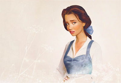
Found this randomly today - it's an interpretation of what the disney princess' would look like in real life! The artwork is by artist Jerika Väätäinen. My personal favourites are Jasmine and Jane, but I loved all the others as well, including Ursula! Jerika is a Finnish photographer and designer who is currently studying Graphic Design in Bournemouth. His series on Behance called, Envisioning Disney Characters in "Real Life"has been a clear favorite even on his Facebook page with 14,582 thumbs up.

Enjoy!

Mulan (Mulan)

Esmeralda (Hunchback of Notré Dame)

Pocahontas (Pocahontas)

Jane (Tarzan and Jane)

Rapunzel (Tangled)

Alice (Alice in Wonderland)

Ariel (Little Mermaid)

Tiana (Princess and the Frog)

Snow White (Snow White)

Aurora (Sleeping Beauty)

Meg (Hercules)

Cinderella (Cinderella)

Belle (Beauty and the beast)

Jasmine (Alladin)

Ursula (Little Mermaid)

Friday, 13 April 2012

The most final storyboard there is for 'The Mailbox'

13th April 2012


Finally uploading this. It was ready quite a while back, but I thought since I've already uploaded one why upload this one as well? Anywho! This is the final animatic, and hopefully I'll try to get as close as I can to this. It's got sound and subtitles for a much better viewing! ;) Enjoy!

On staging and animation

An awesome post on staging for storyboarders! Answered a lot of questions for me! I feel like changing my storyboard again, but I guess I won't now. I'll probably never come to a conclusion.
Happy learning!
http://sevencamels.blogspot.in/2012/04/flat-funny-and-depth-dramatic.html

Another amazing interview of a wonderful animator Cameron Fielding. He's reel is mind blowing!
Hope I can pick up a few tricks from him. :)
http://www.animschoolblog.com/2012/04/animschool-interview-animator-cameron.html

Wednesday, 11 April 2012

The art of Ratatouille Review


8:07 PM 9/20/2011

What wonderful art. The art of ratatouille will make you wanna watch the movie ten times over and totally fall in love with the characters all over again. Remy, Emile his brother, Linguini and the wonderful Collete, Skinner the villainous chef, all designed the contrast each other so beautifully. The interiors of a sewage systemn (underground Paris) so wonderfully contrasts the world above. Paris is shown as magnificent as in travel books and for real; so much, that it shows you how Remy dreams of living in Gusteau's kitchen without threatening his life. Designs which express the complexity of the character and the conflicts he faces are depicted so clearly and beautifully, keeping in mind that the audience should relate to this rat, and not get disgusted by the idea of it being in a kitchen of a restaurant. Remy has to hide the one thing he loves - cooking.

It's amazing how similar cooking is to design. The tastes, the smells, colors and textures are like colors and compositions. It made me wanna make movies, and start working on the process of creating the script, story and the visuals that would inspire me to make the rest of it. Brad bird has respectfully credited Jan Pinkava as co-director, who thought of the premise while he was cooking in the kitchen with his wife. These artists I worship, for creating a masterpiece of animation, something the world will love and cherish.

Mesmerizing, magnificent, insightful and delicious! The art of Rataouille is just as good as the movie itself.

A Seperation Review

12th Feb 2012
Watched an amazing film today, that I've been planning to watch for a looong time. It's an Iranian film titled 'A Separation'. It's absolutely beautiful, and I think it's a mus-watch for every film student. The actors were so believable and real that it was getting really hard to read the subtitles simultaneously! I just wanted to delve into their performance. It was stunning. The story is simple - a story about a separation of a married couple, and an incident that takes place in their lives which makes you wonder whether they will stay or separate. On a moral ground it asks so many questions, it makes you choose between two grey people throughout the film. It was so honest, and simple, just the way it happens in reality. The emotions were rooted, and not only did I sympathize, but empathized with the characters of the story.

Lastly, (spoiler alert!) I'd like to write about some of the most beautiful parts in the film.
When the dad's father almost dies and he later bathes and cleans him, while scrubbing his back he sinks into his shoulders and cries. His father, suffering from Alzheimer's doesn't react. It is so real and candid that it makes you uncomfortable.
When the daughter confronts her father, asking him if he knew about the maid's pregnancy, we see what he goes through, trying to lie to his daughter and yet teach her the values and lessons of life. So much in this film is about trust, and doing the right thing, even though you have to do some wrong to reach there. It leaves LOTS of room for interpretation to the viewer, and that's how effective it makes cinema look.
At the end I waited till the credits went off the scene, even though they were in arabic. I wanted to know whether the daughter would ever come out with her decision. And more than that, it was the aftershock of the movie's greatness.

So those who haven't seen it yet, try your best to get a hand on it. You won't regret it. :)

'A Separation' by Asghar Farhadi

Iron Giant Review

8th March 2012

Woke up to the sound of many people cheering. I'm going through a very tough phase right now. I'm fighting with a lot of decisions that are um - not exactly work related. So I couldn't whole-heartedly join the celebration. I knew it was my last year here, and that I would never get to play again in MIT, but I could get myself to go downstairs. So the morning started off pretty terribly. I am now in class, trying to work on my backgrounds. I gotta admit, you really do need A LOT of energy and enthusiam to fuel a project like 'The Mailox'. A shortfilm takes time, patience, and a LOT of self motivation. So once again, I watched 'The Iron Giant' - a HIGHLY underrated 2D animation feature directed by the one and only - Brad Bird!

I gotta say there was so much I didn't notice the first time. Though the effect of the story stayed the same (I was in tears when the giant says 'You stay, I go') there was so much more to see in terms of animation and staging. I also noticed some of the shots would have not been possible without 3D. I saw so many shots that I can refer to while animating! For example, Hogarth running away from the camera, Hogarth on his bicycle, clicking a photo etc. it makes you laugh, and cry, and learn about life. I love the part where a deer in the woods get shot, and Hogarth explains to Giant how he perceives death and the idea of a soul. :)

Well, some fruit out of the uneventful morning! Will start with my backgrounds now!

The Greedy Pencil

This blog is a collection of (some of) my work, the art I do for fun, my inspirations and the sweat that goes into making animated films. Enjoy!